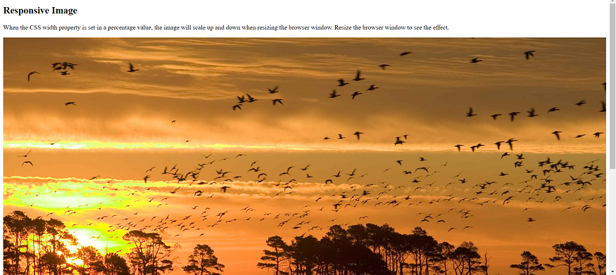
Using the max-width Property — Responsive Web Design
If the max-width property is set to 100%, the image will scale down if it has to, but never scale up to be larger than its original size:

Example
<!DOCTYPE html>
<html>
<head>
<meta name="viewport" content="width=device-width, initial-scale=1.0">
</head>
<body>

<h2>Responsive Image</h2>
<p>"max-width:100%" prevents the image from getting bigger than its original size. However, if you make the browser window smaller, the image will still scale down.</p>
<p>Resize the browser window to see the effect.</p>

<img src="images/Icecream.jpg" style="max-width:100%;height:auto;">

</body>
</html>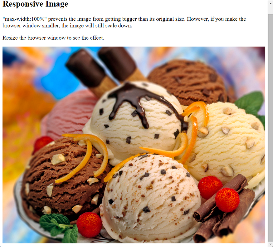
Show Different Images Depending on Browser Width
The HTML <picture> element allows you to define different images for different browser window sizes.
Resize the browser window to see how the image below changes depending on the width:
<!DOCTYPE html>
<html>
<head>
<meta name="viewport" content="width=device-width, initial-scale=1.0">
</head>
<body>

<h2>Show Different Images Depending on Browser Width</h2>
<p>Resize the browser width and the image will change at 600px and 1500px.</p>

<picture>
  <source srcset="images/garden-flowers-small.jpg" media="(max-width: 600px)">
  <source srcset="images/flowers.jpg" media="(max-width: 1500px)">
  <source srcset="images/flowers.jpg">
  <img src="images/flowers.jpg" alt="Flowers" style="width:auto;">
</picture>

</body>
</html>
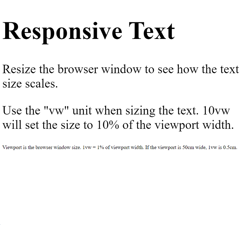
Responsive Text Size
The text size can be set with a “vw” unit, which means the “viewport width”.
That way the text size will follow the size of the browser window:
style=”font-size:10vw;” → Responsive Text
style=”font-size:5vw;” → Resize the browser window to see how the text size scales.
style=”font-size:5vw;” → Use the “vw” unit when sizing the text. 10vw will set the size to 10% of the viewport width.
Viewport is the browser window size. 1vw = 1% of viewport width. If the viewport is 50cm wide, 1vw is 0.5cm.

<!DOCTYPE html>
<html>
<head>
<meta name="viewport" content="width=device-width, initial-scale=1.0">
</head>
<body>

<h1 style="font-size:10vw;">Responsive Text</h1>

<p style="font-size:5vw;">Resize the browser window to see how the text size scales.</p>

<p style="font-size:5vw;">Use the "vw" unit when sizing the text. 10vw will set the size to 10% of the viewport width.</p>

<p>Viewport is the browser window size. 1vw = 1% of viewport width. If the viewport is 50cm wide, 1vw is 0.5cm.</p>

</body>
</html>