Introduction to Bootstrap
(part 2)

In the previous stories we have been discussing about building the static website and today we are going to take forward by developing more.
Today, we are going to move the card to th bottom of the webpage.
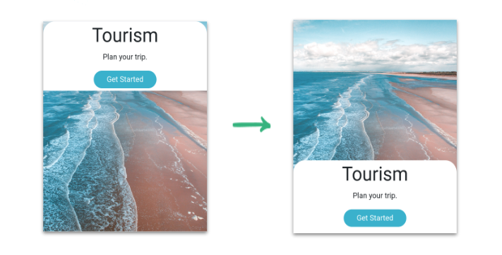
We are going to achieve this by the end of the today’s story. But before that we need to learn few topics to achieve our goal. Noe, let us learn about layout first.
What do you mean by layout?
layout means structuring the information and arranging the elements on the website. Through the layout the information can be shown effictively.
For example, let us look some layouts like INSTAGRAM, youtube…etc.
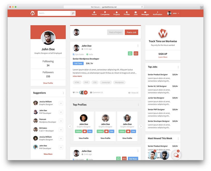
This is the layout of instagram
Methods to design a layout
There are two methods to design the layout of webpage
- Flexbox
- CSS grid
CSS FLEXBOX:
Flexbox is a layout method that helps to arrange the HTML element in row (horizontal) or column (vertical).
Today, we will be learning some flexbox properties like:
- Flexbox container
- Direction
- Justify content
Flexbox container:
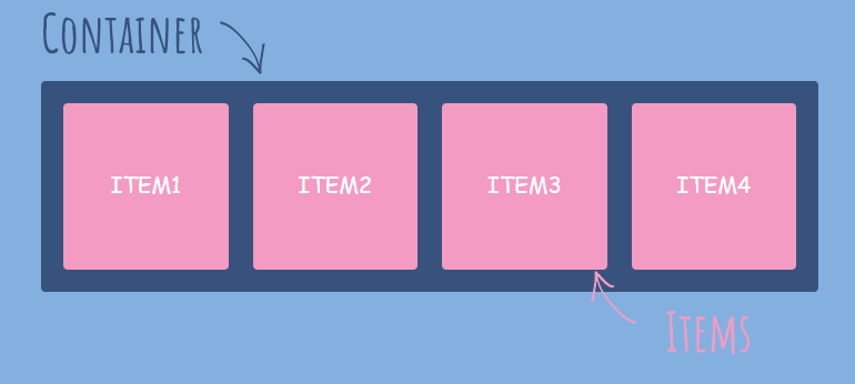
We need to define the flexbox container for the container and all the html elements inside the flexbox container are called flex items.
Flex Direction:
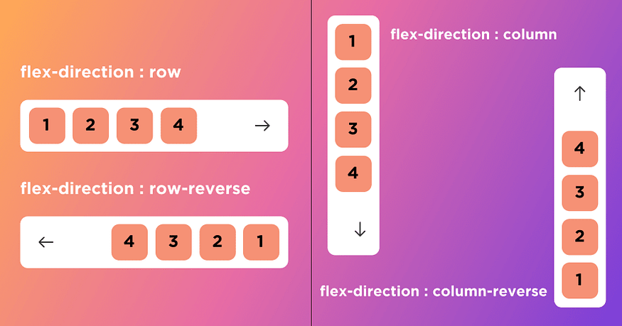
The flex direction specifies the direction in which the flex items should be arranged within the flex container.
Justify Content:
Justify content defines the alignment of flex items along the flex direction.
Example:
for flex direction in rows
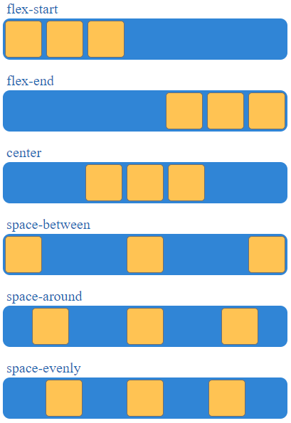
Now let’s arrange the card to the bottom:
Moving card to bottom:
- Defining background container as a flex container.
- Specify the direction in which we move the card.
- Move the card to the bottom of the container.
Bootstrap flexbox class names:
Bootstrap provides us reusable class names that help to design the layout using flexbox.
step1:
Defining background container as a flex container
d-flex is the class name to define flex container.
<div class="bg-container d-flex">step2:
Specifying Direction
Need to move the card vertically (column)
flex-column is the class name to add.
<div class="bg-container d-flex flex-column">Step3:
Justify Content
<div class="bg-container d-flex flex-column justify-content-end">Example:
<!DOCTYPE html>
<html>
    <head>
        <link rel="stylesheet" href="back.css">
        <link rel="stylesheet" href="https://stackpath.bootstrapcdn.com/bootstrap/4.5.2/css/bootstrap.min.css" integrity="sha384-JcKb8q3iqJ61gNV9KGb8thSsNjpSL0n8PARn9HuZOnIxN0hoP+VmmDGMN5t9UJ0Z" crossorigin="anonymous">
        <script src="https://code.jquery.com/jquery-3.5.1.slim.min.js" integrity="sha384-DfXdz2htPH0lsSSs5nCTpuj/zy4C+OGpamoFVy38MVBnE+IbbVYUew+OrCXaRkfj" crossorigin="anonymous"></script>
        <script src="https://cdn.jsdelivr.net/npm/popper.js@1.16.1/dist/umd/popper.min.js" integrity="sha384-9/reFTGAW83EW2RDu2S0VKaIzap3H66lZH81PoYlFhbGU+6BZp6G7niu735Sk7lN" crossorigin="anonymous"></script>
        <script src="https://stackpath.bootstrapcdn.com/bootstrap/4.5.2/js/bootstrap.min.js" integrity="sha384-B4gt1jrGC7Jh4AgTPSdUtOBvfO8shuf57BaghqFfPlYxofvL8/KUEfYiJOMMV+rV" crossorigin="anonymous"></script>
    </head>
    <body>
        <div class="bg-container d-flex flex-column justify-content-end">
            <div class="tourismcard">
                <h1 class="main-heading">Tourism</h1>
                <p class="paragraph">Plan your trip wherever you want to go</p>
                <button class="button">Get Started</button>
            </div>
        </div>
    </body>
</html>
@import url("https://fonts.googleapis.com/css2?family=Bree+Serif&family=Caveat:wght@400;700&family=Lobster&family=Monoton&family=Open+Sans:ital,wght@0,400;0,700;1,400;1,700&family=Playfair+Display+SC:ital,wght@0,400;0,700;1,700&family=Playfair+Display:ital,wght@0,400;0,700;1,700&family=Roboto:ital,wght@0,400;0,700;1,400;1,700&family=Source+Sans+Pro:ital,wght@0,400;0,700;1,700&family=Work+Sans:ital,wght@0,400;0,700;1,700&display=swap");
.bg-container{
background-image:url("images/sunset.jpg");
background-size:cover;
text-align: center;
height:100vh;
}
.tourismcard{
text-align:center;
background-color:white;
padding:10px;
border-top-left-radius:35px;
border-top-right-radius:35px;
}
.main-heading{
color:black;
font-family:monoton;
font-size:30px;
font-weight:bold;
font-style:normal;
margin:0px;
}
.paragraph{
color:black;
margin:0px;
}
.button{
height:36px;
width:138px;
background-color:rgba(17, 156, 230, 0.84);
border-radius:20px;
border-width:0px;
}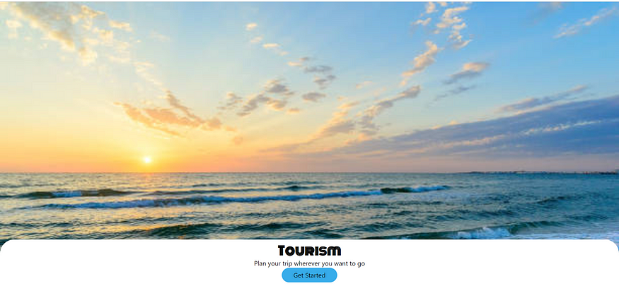
And this is how the card is brought down and let us continue remaining in the next story.

No comments:
Post a Comment